
You combine letters in a logo with four techniques: overlapping them, sharing a stroke between them, using the negative space they create, or arranging them symmetrically. The constraint that decides which one works is legibility — the mark still has to say the name.
A logo built from letters is a sleek and modern way to showcase your brand’s identity. Combining letters allows endless creative possibilities, from monograms that exude sophistication to playful designs that reflect your brand’s personality. Whether you’re looking to craft a logo for a startup, personal brand, or established business, mastering the art of combining letters can set you apart — it’s a technique our designers at Softriver use constantly.
This guide will walk you through the importance of letter logos, creative techniques for combining letters, and common mistakes to avoid. By the end, you’ll have all the tools you need to create a letter-based logo that’s both unique and impactful.
Why Do Letter Logos Work?
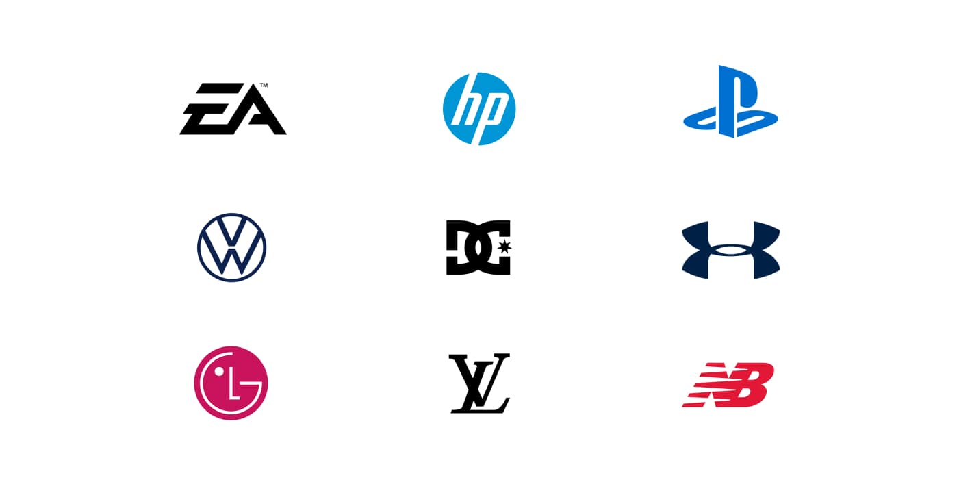
Letter logos are powerful tools in modern branding because they combine simplicity with versatility. By focusing on initials or letter combinations, these logos create a sleek, professional look that is memorable and adaptable to various industries.
One of the biggest advantages of letter logos is their ability to leave a lasting impression. A well-designed combination of letters becomes an iconic symbol that is easy for audiences to recall, whether featured on a business card, website, or product packaging.
Additionally, letter logos are incredibly versatile. Their minimalistic nature makes them adaptable to different branding materials, from digital platforms to physical merchandise. This flexibility ensures your logo maintains its impact no matter where it’s displayed.
Letter logos also allow for creative storytelling. You can convey your brand’s values and personality without the need for elaborate graphics by using negative space, unique typography, or subtle design elements.
Check out our Why Logo Design Is Important for Your Brand for more insights into why logos are critical for building a strong brand.
Next, explore creative techniques to combine letters and craft a logo that stands out.
| Technique | How the letters relate | What it communicates |
|---|---|---|
| Overlapping | Letters are layered or intersected so they read as one form | Connection and unity — suits brands built on collaboration or integration |
| Shared strokes | Two letters reuse the same curve or stem, such as the bowls of a B and a D | Economy and craft; the mark rewards a second look |
| Negative space | The gap between letters forms a third shape or hidden symbol | Memorability, and a detail that people enjoy pointing out |
| Symmetry | Letters are mirrored or balanced around an axis | Order and professionalism; reads well at small sizes |
How Do You Combine Letters?
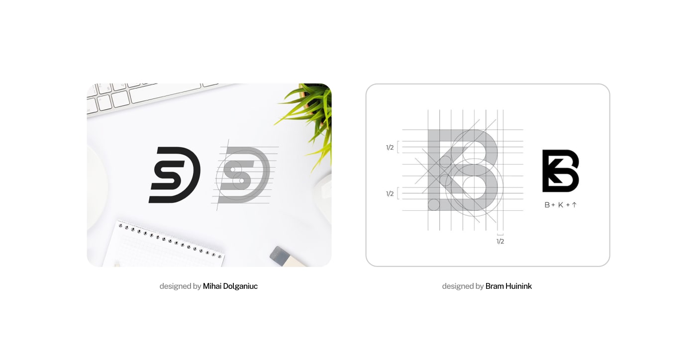
Designing a letter-based logo requires creativity and precision. Here are three effective techniques to combine letters and create a visually striking logo:
Overlapping Letters for a Unified Look
Overlapping letters is a popular technique for blending two or more characters into a cohesive design. You can create a sense of connection and unity by layering or intersecting letters, perfect for brands emphasizing collaboration or integration.
For instance, overlapping can highlight shared elements between letters, such as circular shapes in "B" and "D" or straight lines in "T" and "I." Play with transparency, color gradients, or unique alignments to add depth and dimension while ensuring the letters remain legible.
Using Negative Space for Hidden Messages
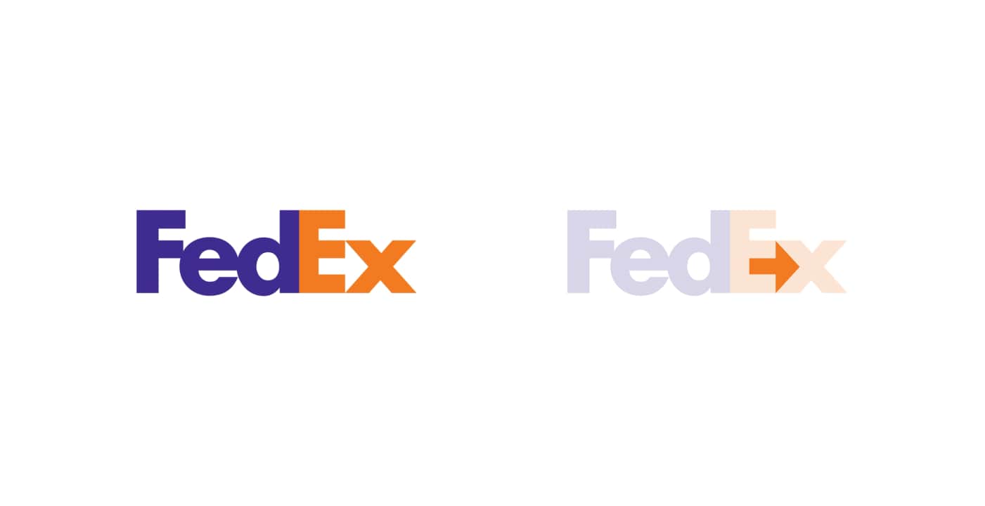
Negative space is a clever design strategy that uses the gaps between letters to create hidden symbols or shapes. This technique adds an element of surprise and sophistication, making your logo more memorable.
For example, the FedEx logo famously uses negative space to create an arrow between the "E" and "x," symbolizing movement and direction. Similarly, combining letters like "A" and "V" can create geometric patterns or subtle icons within the negative space.
Creating Symmetry and Balance for Visual Appeal
Symmetry and balance are essential for creating a harmonious and professional-looking logo. Align letters to form geometric patterns or mirror effects that evoke stability and trust.
For example, pairing letters like "M" and "W" can create symmetry through reflection, while letters like "O" and "D" offer natural balance through their circular shapes. Ensure your design maintains equal proportions and spacing for a polished and timeless look.
By experimenting with these techniques, you can create a letter logo that is aesthetically pleasing and communicates your brand’s story. Ready to dive deeper? Let’s explore the common mistakes to avoid in letter logo design next.
Why Choose a Professional Designer for Letter Logos
A professional designer ensures your letter logo is unique, impactful, and versatile. They tailor the design to reflect your brand, ensure scalability across platforms, and use advanced techniques to combine letters seamlessly.
Your logo will stand out with expert input, saving you time and delivering polished results. Explore our Custom Logo Design Services to create a logo that perfectly represents your brand.
What Mistakes Should You Avoid When Combining Letters?
Three failures account for most letter combinations that do not work.
The letters stop being readable. Overlap and shared strokes both remove information. Past a certain point the viewer sees a shape rather than initials, and the logo no longer says the name. Test it by showing the mark to someone who does not know the brand and asking which letters they see.
The combination only works at one size. A clever intersection that reads on a screen can fill in solid when embroidered or printed small. Check the mark at the size of a favicon and in one colour before committing to it.
The letters come from a font that was never adjusted. Two characters set side by side and nudged together are not a combination mark. The spacing, the weights and often the letterforms themselves have to be redrawn for the pair, which is the part that separates a logo from a piece of typing.
If you want the broader treatment of letter-based marks rather than the combination technique specifically, see our guide to making a logo with letters.
Softriver designs logos and brand identities at a fixed price: $280 for a logo in 2 days, $480 for Premium Branding, $987 for The Brand Ecosystem®, each with a 100% refund guarantee. See what is included on the logo design service page.